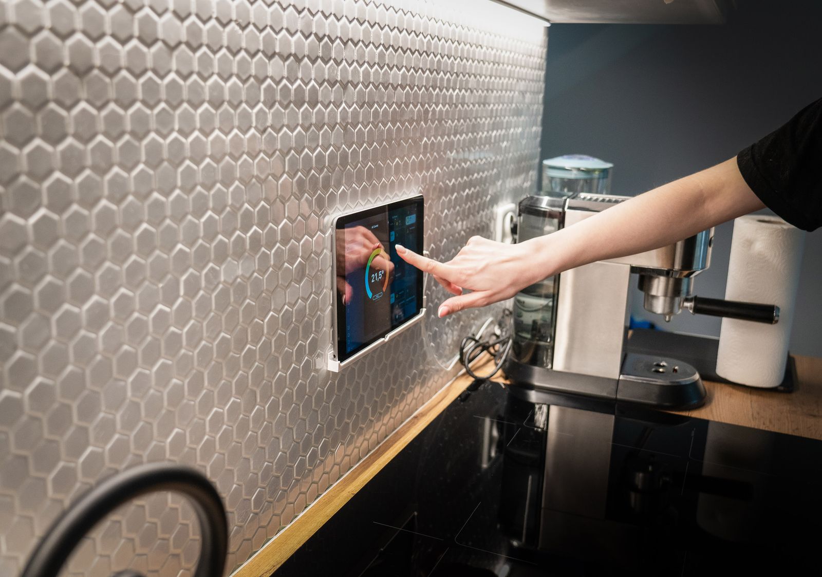
When I first got Home Assistant running on my mini PC, the dashboard that greeted me was an overwhelming wall of every single entity in the house, dumped onto the screen in no particular order. Forty-odd lights, a dozen sensors, the print queue of a printer I’d forgotten was even smart. It worked, technically, but it was the opposite of calm. The whole point of automating a home is that the house gets quieter, not louder.
So this is the guide I wish I’d had on day one: how to go from that default mess to a clean, room-based dashboard you’ll actually enjoy opening. No custom cards, no YAML, no add-ons — just the tools built into Home Assistant today. I’ll flag the YAML escape hatch at the end for when you outgrow this, but you won’t need it to get something good.
First, understand what you’re actually editing
Three words untangle most of the confusion. A dashboard is the whole thing you open — you can have several (one for the family, one for your own tinkering, one for a wall tablet). Each dashboard holds one or more views, which show up as tabs across the top; a view is usually one room or one theme, like “Living Room” or “Energy”. And each view is filled with cards, the individual tiles that show a temperature, toggle a light, or play music. Dashboard holds views, views hold cards. That’s the entire mental model.
The good news for beginners in 2026 is that Home Assistant already builds a surprisingly decent starter dashboard for you. Out of the box it generates a “Home” dashboard that groups your devices by area, with summary cards for things like lights, climate and security pulled to the top — especially on mobile. If you’ve diligently assigned your devices to rooms, you may be 60% of the way there before you touch anything.
Do the boring step first: assign everything to an area
I know. You want to make it pretty. But every shortcut in modern Home Assistant leans on your devices knowing which room they’re in, so ten minutes here saves an hour later. Go to Settings → Devices & services → Devices, open anything that’s homeless, and assign it an area. While you’re at it, rename things to how you actually speak: “Bedroom lamp”, not “0xA4C138 — Tuya dimmer 2”. If you want to reorganise how rooms and floors are grouped, that lives under Settings → Areas, labels & zones. Anything left without an area gets dumped in an “Unassigned” pile, which is your to-do list.

Take control of the dashboard
To start editing, open your dashboard, click the three-dot menu in the top-right and choose Edit dashboard. The first time, Home Assistant asks whether you want to take over control. Say yes. This converts the auto-generated dashboard into one you own and can change freely. The trade-off — worth knowing — is that it stops auto-updating as you add new devices, so future gadgets won’t appear by magic; you’ll add them yourself. That’s a fair deal for a layout that’s actually yours.
If you’d rather experiment without fear, create a fresh dashboard to play in: Settings → Dashboards → Add dashboard. Build your masterpiece there, leave the original untouched as a safety net, and promote the new one once you’re happy.
Build a room with a sections view
When you add a new view, pick Sections as the type. This is the modern default and it’s the one to use. Sections arranges cards on a tidy grid and lets you cluster them into labelled groups — “Lights”, “Climate”, “Media” — and drag those groups around, all without the old trick of nesting cards inside vertical and horizontal “stack” cards. You can set how many columns it’s allowed to use, and it reflows sensibly between your phone and a widescreen monitor. For a beginner this is the single biggest quality-of-life feature: it makes a neat layout almost the default outcome rather than something you fight for.
My advice: make one view per room. Living Room, Kitchen, Bedroom, Office. Within each, a section for lights, a section for climate, maybe one for media. Resist the urge to put everything on one giant screen — tabs are free, and a view you can take in at a glance beats a view you have to scroll.
Add cards the easy way with the new card picker
Inside a section, click Add card. In older versions this threw a grid of three dozen cryptic card types at you and wished you luck. The 2026.6 release rebuilt this around a much friendlier idea: instead of asking which card type you want, it asks which thing in your home you want to show, then suggests the cards that actually make sense for it. Better still, every suggestion renders as a live preview using your own data, so you see exactly how that thermostat or light tile will look before you commit. If you’ve installed any community cards, their suggestions appear in a separate section just below the built-in ones.
For most rooms you only need a small vocabulary of cards. The Tile card is your workhorse — one clean tile per light, switch or sensor, tappable to toggle, hold for more. The Area card gives a whole room at a glance with a photo background. Thermostat for heating, Light for a dimmer you want a big control on, and a Weather or Energy card if you like those up top. Start with Tile cards everywhere and only reach for fancier ones when a tile genuinely isn’t enough.
Polish, then stop
A few finishing touches go a long way. Give each view an icon so the tabs are scannable — a sofa for the living room, a bed for the bedroom. Drag your most-used view to the front so it’s what opens first. And genuinely consider deleting cards: the dashboard you check ten times a day should show the ten things you actually act on, not all 200 entities you happen to own. The printer ink level can live on a “Stuff” tab you never visit.
Then — and this is the hard part for people like me — stop fiddling and go live with it for a week. You’ll quickly learn which cards you reach for and which were just decoration, and the second pass will be far better informed than any amount of upfront agonising.
When you outgrow the UI: the YAML escape hatch
Everything above happens in the visual editor, and for a lot of people that’s the whole journey. But eventually you’ll want something the buttons don’t offer — a templated card that changes colour on a condition, or to copy a perfect room layout to three other rooms without re-clicking it all. That’s when you flip a view (or the whole dashboard) into raw configuration editor mode from the three-dot menu and edit the underlying YAML directly. It’s the same dashboard, just described in text you can copy, paste and version-control. My honest advice: don’t start there. Learn what a good dashboard feels like in the UI first, and drop into YAML only when you hit a specific wall. You’ll write much better config once you know what you’re aiming for.
That’s it. Assign your areas, take control, build one sections view per room, lean on the new card picker, and be ruthless about what earns a spot. Do that and the dashboard stops being a chore you tolerate and becomes the calm little control room the whole project was supposed to produce.
Leave a Reply